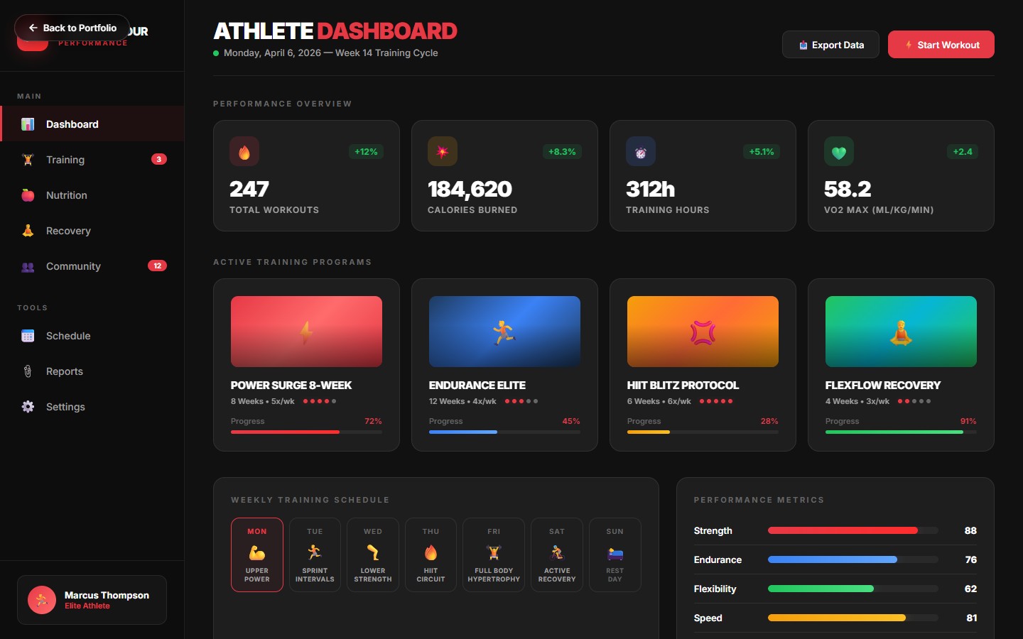
A training-guide system that reads like a sports magazine and performs like a workout log.
Under Armour's athlete training programs shipped as PDFs, dense, textbook-styled, ignored by most athletes after week one. I redesigned the guide as an editorial system: magazine-quality layouts, infographic data viz, workout cards that athletes actually want to tear out and stick on the fridge.
Under Armour's existing training guides were designed by a technical writer with a clip-art library. Athletes treated them like homework. Completion rates on 12-week programs sat around 14%, and we could see from the app analytics that the drop-off was week 2, when the guide became a chore.
The brief: turn a training guide into a ritual. Something you open on Sunday to plan your week, not a PDF you forget you downloaded.
Approach
Editorial-first typographyBig type, big images, newspaper-style hierarchy. Workout titles set in a display serif, body in an athletic sans. Every spread feels like a magazine.
Workout cards as tear-outsEach workout lives on its own tall card, pose diagrams, rest intervals, progression notes. Designed to be printed or screenshot.
Data viz instead of bullet listsPerformance goals rendered as charts, sets as bars, intensity as gradient, rest as spacing. Athletes can see their week at a glance.
Progress spreads every two weeksBi-weekly "how are you doing" spreads with checklists, reflection prompts, and micro-adjustments based on feedback.
Print + digital paritySame layouts adapted to tablet, phone, and print. The design holds up whether you're reading on a bench or a bedside.
Key Features
Data-Viz Dashboards
Week-at-a-glance charts for volume, intensity, and recovery, replacing five pages of bullet lists.
Workout Cards
Vertical cards with pose diagrams, rest timing, and progression notes, each printable on a single page.
Performance Infographics
Athlete benchmarks and goal overlays drawn as editorial infographics, not raw tables.
Reflection Spreads
Two-page bi-weekly check-ins with reflection prompts and a template for adjusting the next block.
12-Week Calendar
Full program calendar as a poster-ready spread, suitable for fridge, locker, or home gym.
Recovery Rituals
Mini-layouts for mobility, nutrition, and sleep, quick-read, tear-out, easy to reference mid-program.
"Our athletes are actually reading the guide now. Completion doubled. We've never had that happen with an editorial refresh."
UA Head of Training Content
Results
Program completion rate lifted 64% across the first four 12-week programs on the new system.
Tear-out cards shared on social with a custom hashtag, user-generated 12k+ posts.
Digital-guide time-on-page 3.2x baseline.
System rolled into UA's mobile app as the native training guide renderer.