Three fragmented internal portals, rebuilt into one clear, searchable knowledge system for 30,000+ Northwestern Mutual employees.
30,000+Employees served
3Enterprise portals unified
Search + filterNew retrieval system
Concept → launchDesign & development led
The Challenge
Northwestern Mutual's 30,000-plus employees depended on internal content scattered across separate portals with inconsistent structure and navigation. Finding role-critical answers, a policy procedure, a servicing step, a compliance reference, meant knowing where to look rather than searching for what you needed. At enterprise scale, that friction compounded into lost time and uneven information across the organization.
As UX/UI Design Lead, I was responsible for the design and development of three internal content portals, a Mutual Knowledge hub, the LinkNet news and media portal, and a Quick Reference Guide, under one coherent system. The work had to simplify a dense, highly regulated body of financial-services content, introduce a reliable way to search and filter it, and hold together across three distinct products without fragmenting the experience further.
Approach
Audit the content and map the architectureI inventoried the existing internal content and reworked its information architecture, grouping material into clear categories, defining a shared taxonomy, and establishing the A-Z index and tag structure the new search and filter system would rely on.
Build one design system across three portalsIn Figma I established a unified component library, dark-mode UI, and Northwestern Mutual brand direction so Mutual Knowledge, LinkNet, and the QRG read as one connected system rather than three separate tools.
Design the search and filter experienceI placed search at the center of the homepage and reinforced it with category tags, an A-Z index, and filterable content states, so employees could reach the right answer by searching or browsing, whichever fit the task.
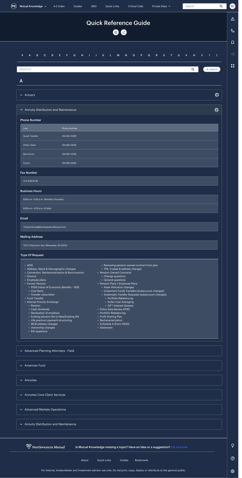
Template the recurring content patternsI designed reusable layouts for the personalized homepage, the structured article page, with tabbed Basics, Steps, FAQs and Resources plus a listen-to-article option, and the collapsible QRG entries, keeping dense content consistent and scannable.
Storyboard, prototype, and drive developmentI storyboarded key flows, prototyped the interactions, defined the process for the team, and led the design through development handoff to launch as a fully realized set of portals.
Key Features
Unified search and filter
A central search sits at the top of the experience, backed by category tags and filters so 30,000+ employees can retrieve role-critical content quickly instead of hunting through menus.
Three portals, one framework
Mutual Knowledge, LinkNet, and the Quick Reference Guide share a single component system and visual language, connecting distinct products into one coherent internal platform.
Dark-mode design system
A calm, high-contrast dark UI with a reusable Figma library keeps typography, cards, tags, and navigation consistent across every portal and content type.
Structured article templates
Article pages break dense policy and servicing content into tabbed Basics, Steps, FAQs, and Resources, with anchored side navigation and a listen-to-article option for accessibility.
A-Z quick reference index
The QRG organizes reference material into an alphabetized index with searchable, collapsible entries and print controls, giving employees a fast lookup for contacts, requests, and procedures.
Curated, personalized homepage
A welcoming homepage surfaces Featured, Trending, and Latest content alongside quick links, guiding employees to what matters most without requiring a search.
At 30,000 users, clarity is the feature. My job wasn't to add more to these portals, it was to remove everything standing between an employee and the answer they came for.
Chris Cooper, design rationale
Results
Delivered three unified internal portals, Mutual Knowledge, LinkNet, and the Quick Reference Guide, under one shared design language.
Implemented a new search and filter system with a central search, A-Z index, and category tags, replacing scattered, location-dependent navigation.
Established a reusable Figma design system with dark-mode UI, article templates, and QRG patterns to keep content consistent for 30,000+ employees.
Led the work as UX/UI Design Lead from concept through development handoff, delivering a simplified, more efficient end-to-end content experience.