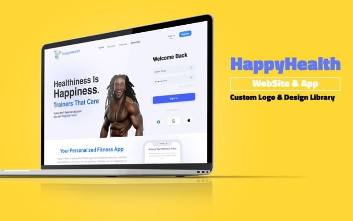
A fitness and wellness app that matches people by shared goals, turning solo workouts into a relationship-driven habit.
FullBrand system
Branding → UX/UIScope of work
MobilePrimary platform
FigmaDesign tool
The Challenge
Fitness apps overwhelmingly treat exercise as a solo discipline, a tracker, a streak, a number to beat. The result is a category that motivates the already-motivated and quietly loses everyone else the moment willpower dips. HealthHappy started from a different premise: that consistency is easier when it's shared, and that the right partner is a stronger retention mechanic than any badge or leaderboard. The design problem was to make relationship-based matchmaking feel native to a wellness product rather than bolted on from dating apps.
That framing raised real tension. Matchmaking patterns carry baggage, they can read as superficial or transactional, which is exactly the wrong tone for health and wellbeing. The work had to hold two ideas at once: the warmth and trust of a wellness brand, and the momentum of a social matching experience. Every branding and interface decision had to earn credibility as a fitness tool first, then layer connection on top without cheapening either side.
Approach
Define the positioningFramed HealthHappy as a wellness-first product where matchmaking serves consistency, not the other way around. This positioning anchored every downstream branding and UX decision and kept the concept from drifting into dating-app territory.
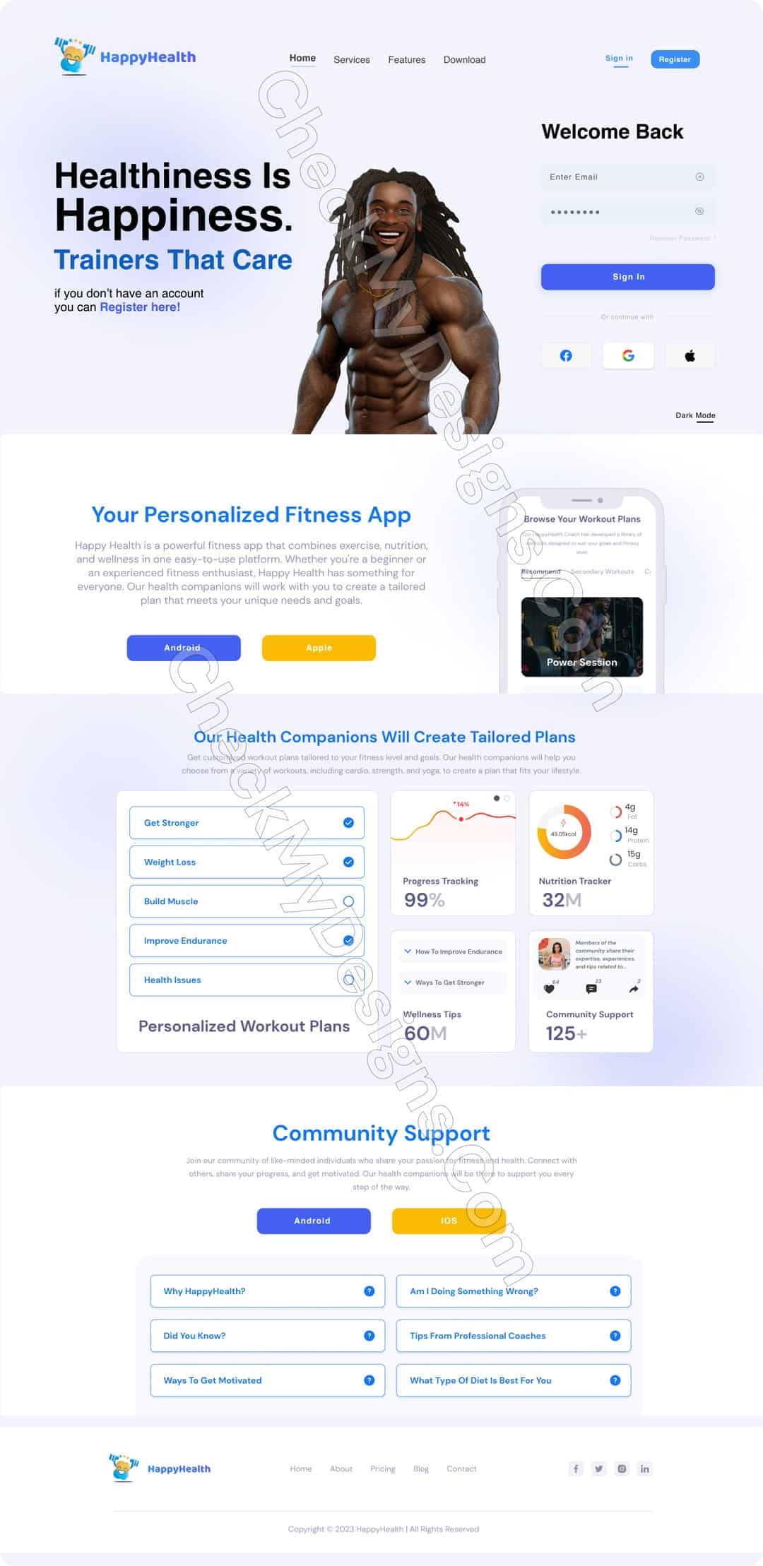
Build the brand systemDesigned the identity end to end, name treatment, colour, type and a warm, approachable visual language that signals health and trust. The brand had to feel encouraging rather than performance-obsessed, setting HealthHappy apart from metric-heavy competitors.
Map the core journeysStructured the flows around the two things that matter: getting a user active quickly, and connecting them with a compatible partner. Onboarding, matching and the daily home experience were designed as one continuous loop rather than separate features.
Design the mobile UX/UITranslated the flows into a clean, legible mobile interface, using the homepage as the daily anchor where activity and connection meet. Layout, hierarchy and components were built for glanceable, repeat use.
Direct the photographyEstablished an art direction for imagery that reinforces the brand's warmth, real, relatable wellness moments over polished stock, so the product feels human and inclusive rather than aspirational and exclusionary.
Key Features
Relationship-based matchmaking
The core concept, pairing users by shared fitness and wellness goals so progress happens alongside a partner rather than alone.
Wellness-first home
A homepage designed as the daily anchor, bringing activity and connection into a single, glanceable view built for repeat use.
Complete brand identity
A full brand system, colour, type and visual language, tuned to feel warm, trustworthy and encouraging rather than clinical.
Guided onboarding
An entry flow that gets users active fast while gathering the signals needed to make meaningful, compatible matches.
Art-directed photography
A relatable imagery style that reinforces the brand's inclusive, human tone and grounds the product in real wellness moments.
Consistent UI system
A cohesive set of components and layouts across the mobile experience, keeping hierarchy and interaction predictable screen to screen.
Matchmaking only belongs in a wellness product if it serves consistency, the partner is the retention mechanic, and the brand has to earn trust before it earns a swipe.
Chris Cooper, design rationale
Results
Delivered a complete product concept spanning branding through mobile UX/UI, cohesive from identity to interface.
Established a warm, trustworthy brand system that positions HealthHappy apart from metric-driven fitness apps.
Defined a homepage and core flows that fold matchmaking into the daily wellness routine rather than treating it as a side feature.
Produced an art direction for photography that carries the brand's inclusive, human tone across the experience.
Strategy
Wellness-first positioning with matchmaking in service of consistency
Retention framed around compatible partners over streaks and badges
Brand tone balancing health-and-trust with social momentum
Concept scoped as a self-directed personal project
Design
Full brand identity, colour, type and visual language
Mobile-first UX/UI with a homepage daily anchor
Onboarding and matching flows designed as one continuous loop
Reusable UI components for consistency across screens
Art direction for warm, relatable wellness photography
Tools
Figma, branding, UX flows, UI design and prototyping