EggWise walks with people through one of life's most emotional journeys. I built the brand, the product experience, and a full design system, warm where healthcare is usually cold.

Every screen exists to make one feeling tangible: you are not alone, and this is human, not a medical chart.
Fertility apps tend to treat people as patients-as-problems: cold blues, clinical charts, stat dumps. EggWise takes the opposite stance. It speaks like a trusted friend who happens to know the science, acknowledging feeling before data, celebrating small wins, and never using alarmist language.
The work spans three fronts that had to feel like one product: a brand with a distinct warmth, a patient app that carries someone through tracking, learning, and community, and a clinical portal for the fertility teams who care for them, all held together by a single, documented design system.
Three tensions shaped every decision.
People arrive anxious and hopeful. The product had to lead with reassurance, "your fertile window is open", before ever showing a number.
A frightened first-time patient and a busy fertility clinician need opposite things from the same platform, softness versus density, without feeling like two products.
As a founder shipping fast, I needed one source of truth, tokens, components, themes, so new screens and marketing stayed unmistakably EggWise.
Cream grounds instead of sterile white. Dusty-teal as a calm primary, warm-peach and soft-gold as emotional accents. Generous rounding and soft, layered shadows. Nothing sharp, nothing cold.
Copy speaks to "you"; the product is "we." Good news earns a gold sparkle. Empty states encourage instead of dead-ending. Numbers arrive only after the reassurance lands.
Semantic tokens let a single component library re-theme from a patient's warm cream to a clinician's focused dark, same DNA, different job.
Gentle ease-out entrances, a springy pop for confirmations, slow ambient loops. No harsh or mechanical movement, and everything settles calmly under reduced-motion.
The mark is a teal egg with a gold "wave" and a sparkle cluster, care and celebration in one glyph. The tagline says the rest: Smart Fertility Starts With You.
Uppercase · Poppins 800 · wide tracking. For CTAs, stat labels, eyebrows.
Tokens, components, and three themes, documented so brand, app, and marketing all stay unmistakably EggWise. Shown here on the app's dark-first surface.

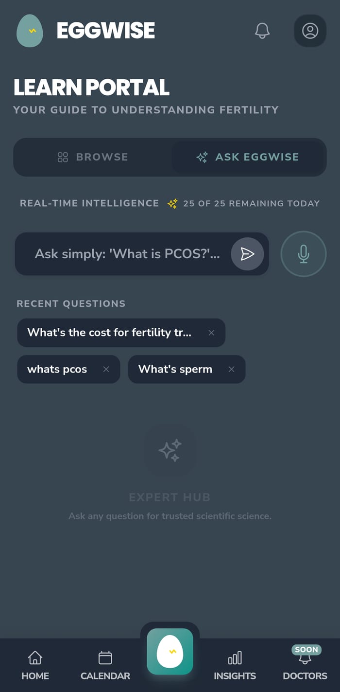
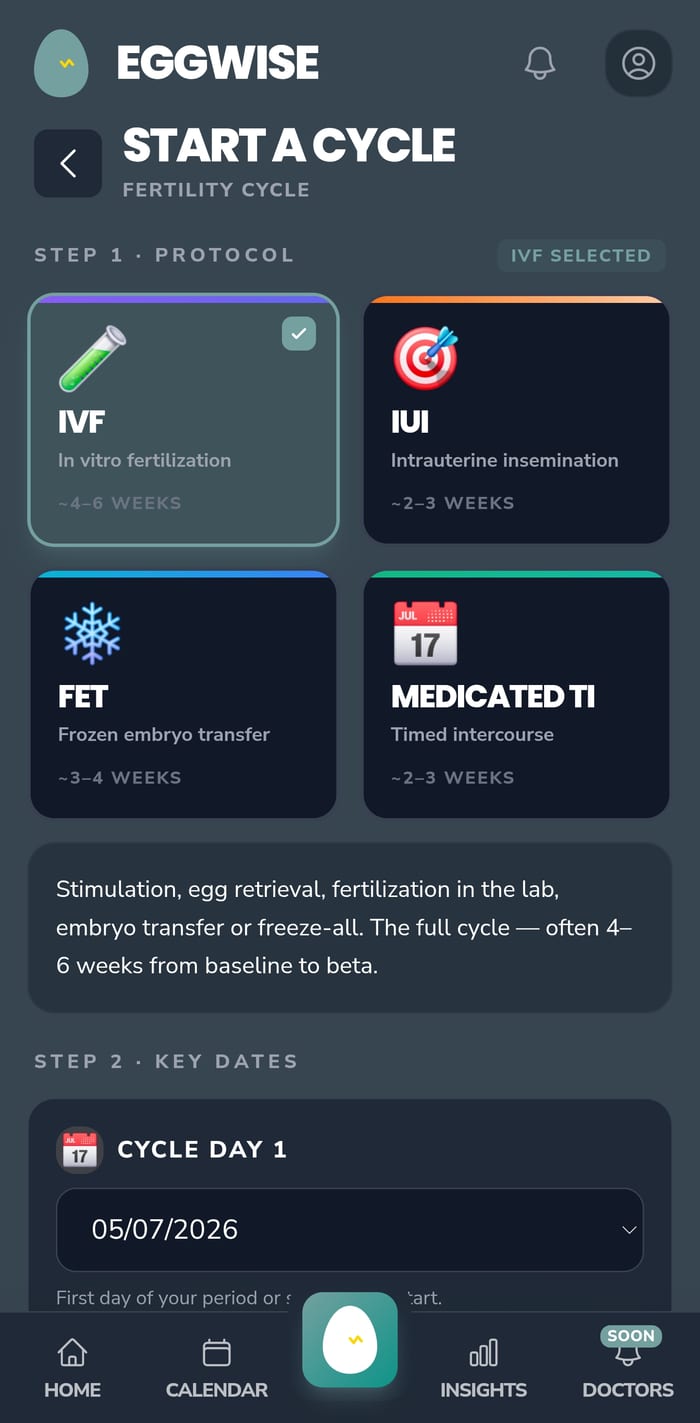
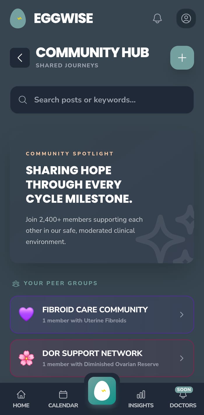
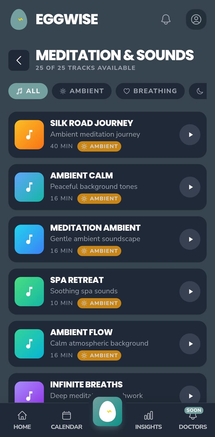
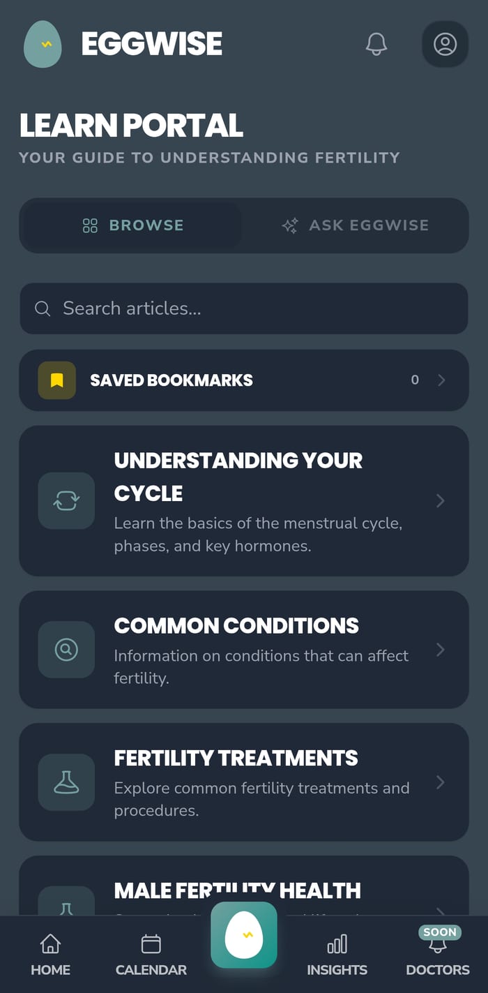
Tracking, understanding, treatment, calm, and community, each screen leads with reassurance, then reveals the science underneath.

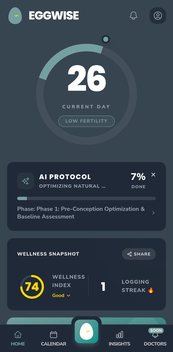
The cycle ring, an AI-guided protocol, and a wellness snapshot greet you the moment you open the app, framed emotionally before a single statistic appears.


tracking, learning, calm & care, all built from the same system.
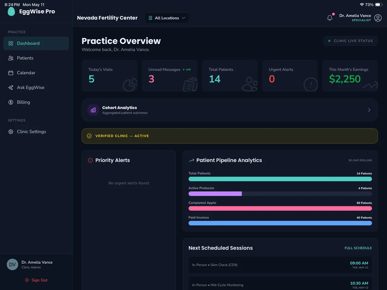
Clinicians get a denser, dark-first workspace, practice overview, patient pipeline, live status, built from the same tokens and components as the patient app. One design system, two jobs: softness for families, precision for the teams who care for them.

The system stretches into a full growth engine, store listings, social campaigns, Pinterest content, and print, all painted from the same tokens.
One platform for the families on the journey and the clinics who guide them. The hero line that ties the patient app and EggWise Pro together across every channel.


EggWise
EggWise
EggWise
EggWise
EggWise
EggWiseSemantic tokens let every surface re-theme automatically, warm by default, focused in the dark, expressive when it's time to celebrate.
“The goal was never a prettier fertility app. It was to make people feel a little less alone, and to build a system warm enough to keep it that way as we grow.” ✦