A full-scope website redesign that gave a dental technology brand a coherent identity and a clear product story, from strategy to art direction.
FullBrand & UX system
5Core screens designed
DesktopPrimary layout scope
Concept → deliveryEngagement span
The Challenge
Byte Dental needed a complete website redesign delivered in a short time frame, with no established brand foundation to build on. The work had to move fast without cutting corners: define who the brand was, translate a technology-forward dental proposition into something a visitor could understand in seconds, and ship a design system that held together across every page. The compressed schedule meant strategy and interface work had to run in parallel rather than in sequence.
The deeper problem was clarity. Dental technology sits in an awkward middle ground: too clinical to feel approachable, too consumer-facing to lean on jargon. The redesign needed to carry brand strategy, UX strategy, and art direction as one continuous decision, so the home page, the how-it-works narrative, the pricing model, and the product dashboard all read as chapters of the same story rather than disconnected templates.
Approach
Set the brand strategy firstBefore any interface work, I defined the brand's positioning and voice for the dental technology space, the personality, tone, and visual direction that every downstream screen would inherit. This gave the fast-moving design phase a fixed reference point.
Map the UX strategy around key momentsI structured the site around the decisions a visitor actually makes: understand the product, see how it works, weigh the pricing, and picture the experience inside the dashboard. That sequence set the page architecture for the full layout.
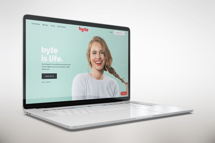
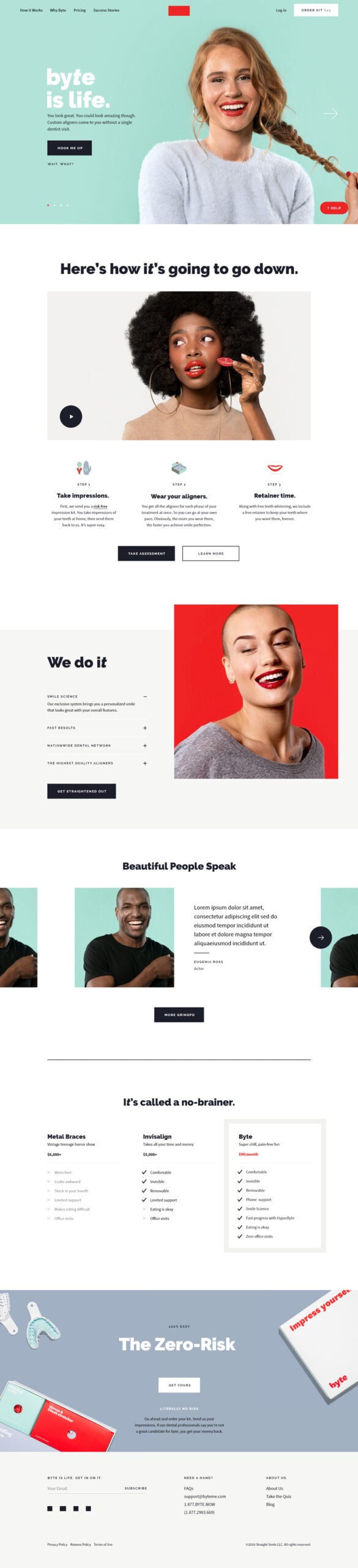
Design the home page as the anchorThe desktop home screen established the type scale, color system, spacing, and art direction. It functioned as the reference frame, so every later page borrowed proven patterns instead of inventing new ones under time pressure.
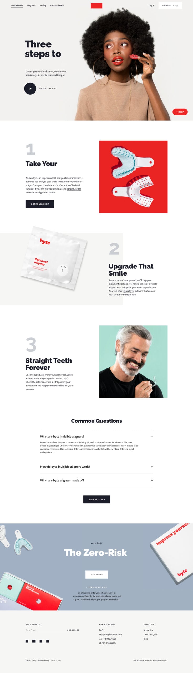
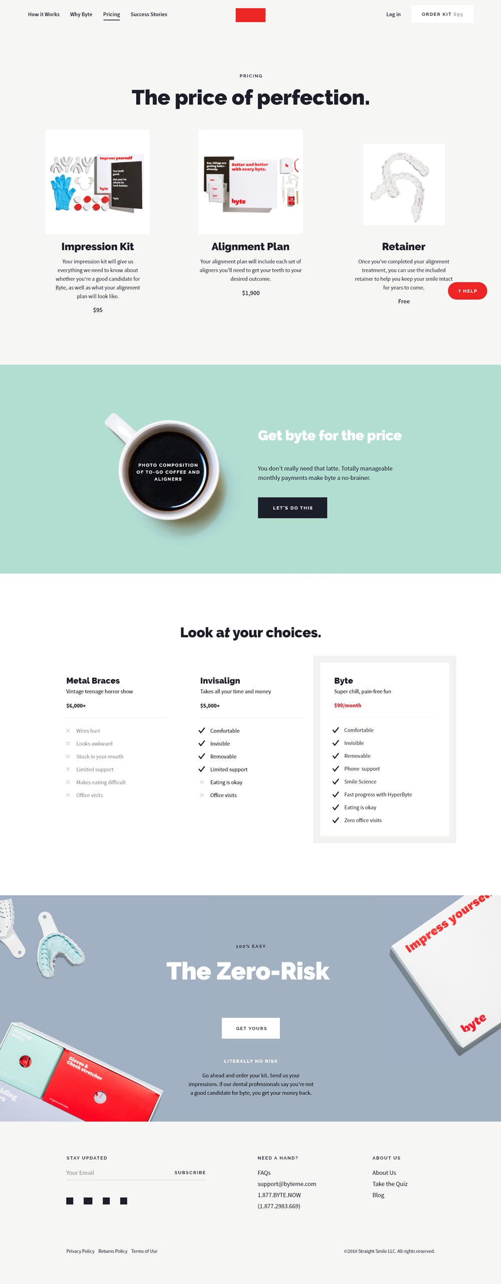
Build the explanatory and pricing pagesThe How It Works and Pricing screens turned the value proposition into a legible narrative and a transparent model, the two pages where a technology brand most often loses people to confusion.
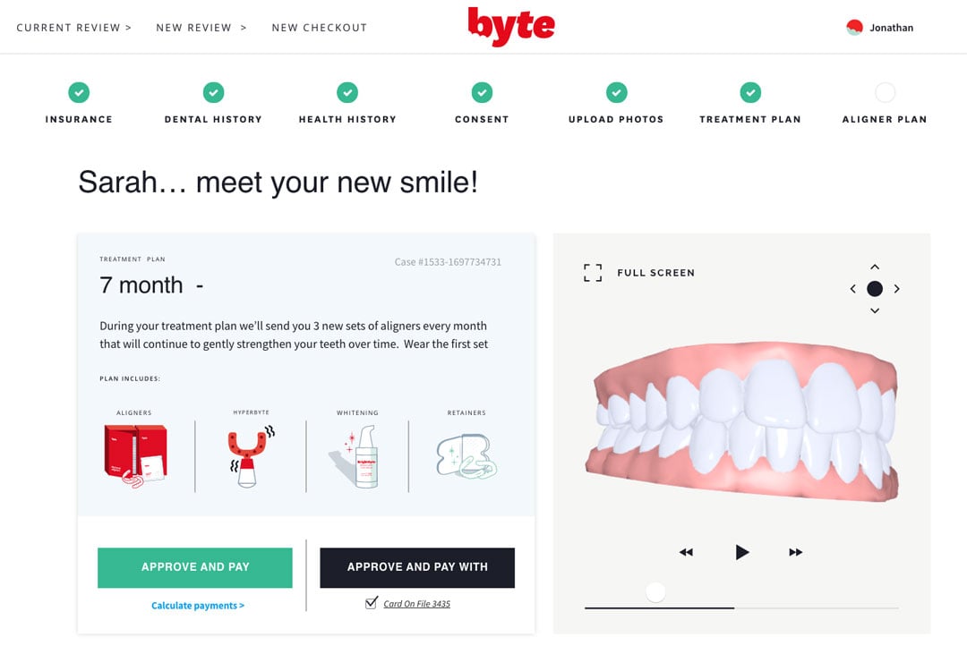
Extend into the product dashboard flowThe dashboard flow carried the marketing language into the product surface, so the promise made on the home page matched the experience once a user was inside. This kept the brand consistent from first impression to daily use.
Key Features
Cohesive brand system
A full visual identity, type, color, and art direction, defined for a dental technology brand and applied consistently across every screen.
Structured page architecture
A UX strategy that orders the site around real visitor decisions, from first impression through pricing to the product itself.
Anchored home layout
A desktop home page that sets the tone and establishes the reusable patterns the rest of the site inherits.
How It Works narrative
A dedicated flow that translates a technical dental proposition into a clear, step-by-step story a visitor can follow.
Transparent pricing page
A pricing layout designed for legibility and confidence, presenting the model without clutter or ambiguity.
Product dashboard flow
A dashboard experience that extends the brand and language from marketing into the working product surface.
On a tight timeline, consistency is the fastest thing you can build, one honest system beats ten clever pages.
Chris Cooper, design rationale
Results
Delivered a complete website redesign, brand strategy, UX strategy, UI/UX, and art direction, within a short time frame.
Established a full brand and design system that a dental technology company had not previously had, ready to scale beyond the launch set.
Produced a cohesive set of core screens, home, how it works, pricing, and dashboard flow, that read as one connected experience.
Bridged marketing and product by carrying the same visual language from the home page into the dashboard flow.
Strategy
Brand strategy and positioning for a dental technology brand
UX strategy structured around key visitor decisions
Parallel strategy-and-design workflow to fit a compressed timeline
Content hierarchy for home, how-it-works, and pricing narratives
Design
Art direction and visual identity system
Desktop home, How It Works, and Pricing layouts
Dashboard flow design extending brand into the product
Reusable type, color, and spacing patterns across the full layout
Tools
Figma for UI design, layout, and component patterns
Figma for art direction and brand system documentation